Project Snapshot
Role: Lead Product Designer
Team: Product, engineering, content, design, and business stakeholder
Platforms: Web, mobile, and tablet
Opportunity
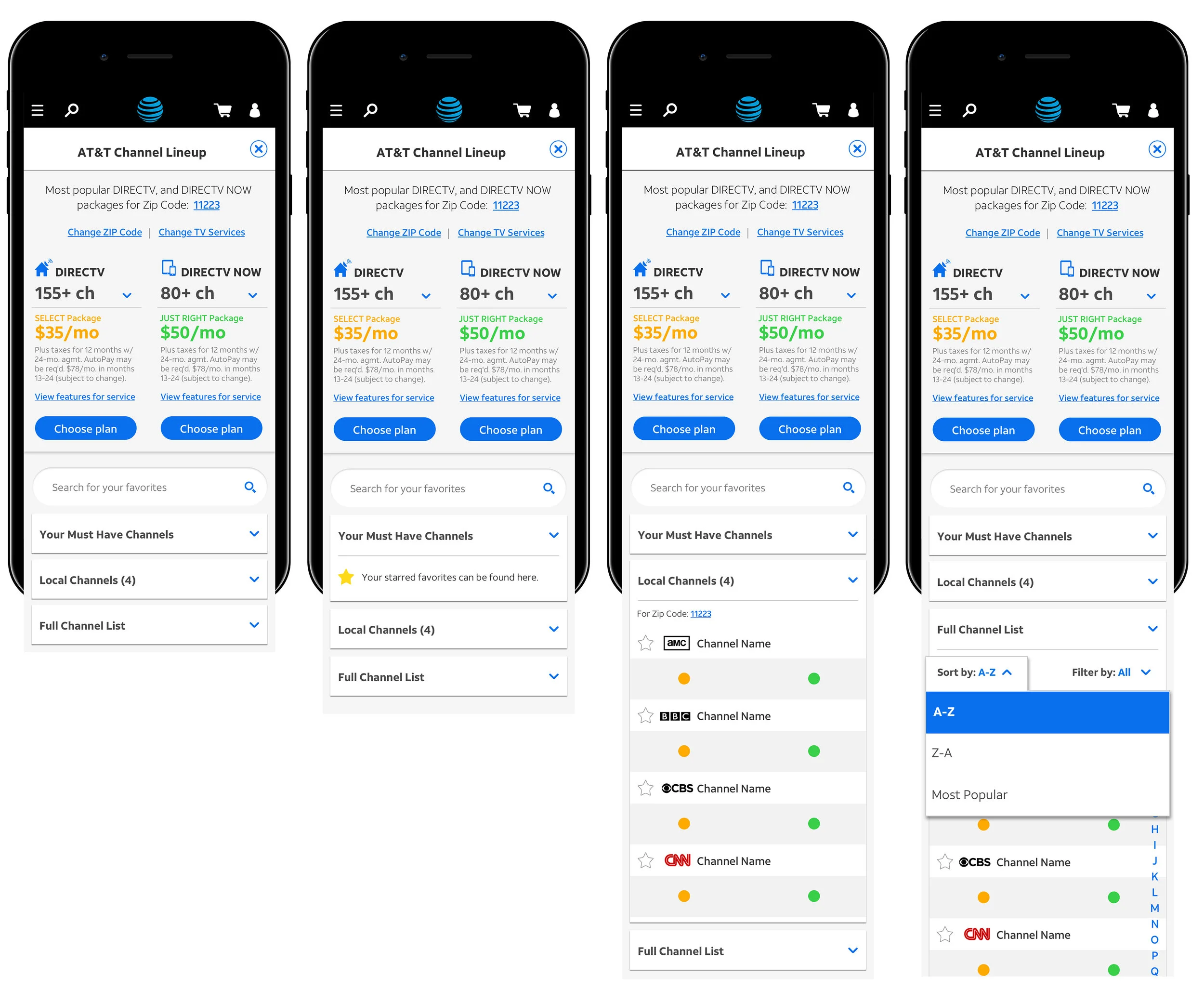
Customers shopping for TV packages needed to evaluate channels, confirm their favorites were included, and compare services before committing. The existing experience made none of that easy. Research revealed that users struggled to surface the channels they cared about and had no clear way to compare options, creating friction at the most critical point in the purchase decision.
The channel lineup experience was originally built only for desktop. On mobile, navigating dense, unresponsive layouts made scrolling nearly impossible, information hierarchy was inconsistent, and content was difficult to parse, breaking down at the screen size where users needed it most.
Previous version
Merch One unified independently built micro-apps into a single seamless product experience, held together by a shared LDM design system. Delivered across two phases, the platform evolved from a consolidated navigation to a full redesign with a personalized dashboard, a top nav for tool switching, and a dedicated in-tool navigation for deeper workflows.

Solution
I simplified the entry into the channel lineup flow by progressively narrowing the experience based on location and service type, reducing the amount of content users had to process at once. From there, sorting, filtering, and favoriting gave users the control to compare channels across packages on their own terms. These tools were directly informed by user interviews, where it became clear that users needed a faster, more personal way to evaluate whether a package was worth it before making a decision.